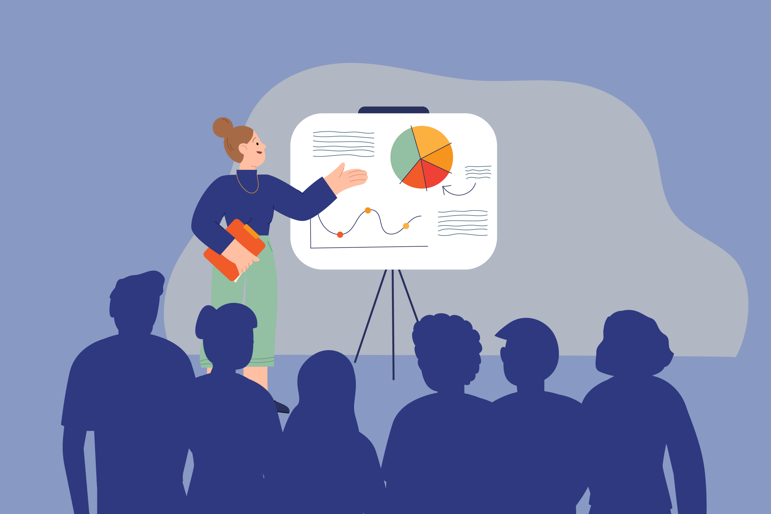
With rows of posters competing for attention at any scientific conference, the real challenge isn’t just to inform, but to capture the audience’s interest. A conference poster is not just a summary of your research. It is often your first chance to spark interest, start a conversation, and pull someone into your world of research.
Here are some practical tips for creating a poster that doesn’t just sit silently on the wall but draws the crowd in.
Adapt to Your Audience
Tailor your content to the audience. If you’re addressing a general or lay crowd, keep it accessible: avoid jargon, use bright visuals, and embrace creative layouts. If your audience is more specialized, provide just enough background to orient them, then dive straight into the core insights or findings.


Simplify and Prioritize Key Information
A scientific poster isn’t a place for dense paragraphs or lengthy tables. It should offer a clear, visually engaging snapshot of your research. Imagine your poster as a trailer for your work—it should tease the story, not tell the whole thing.
Word Count Matters: Keep It Brief
As for word count, less is more. Aim for 250–350 well-chosen words. This ensures your message is easily digestible, and your poster remains clean and eye-friendly. Remember: your real-time explanation is what fills in the gaps—your poster is simply the hook.
Stay Consistent with Style
Maintain consistency in your font choices, colour palette, and overall style throughout your poster. This coherence makes your poster look professional and organized, and it helps the viewer focus on the content rather than the design elements. Check out this blog post for a guide to the best tools for creating posters.
Use High-Quality Graphics
Visuals can significantly enhance the impact of your poster. Include clear, high-resolution images, graphs, and charts that illustrate your findings. Make sure your visuals are labelled appropriately and referenced within your text, so the audience understands their relevance. To discover where to find high-quality vector graphics, read this blog post.
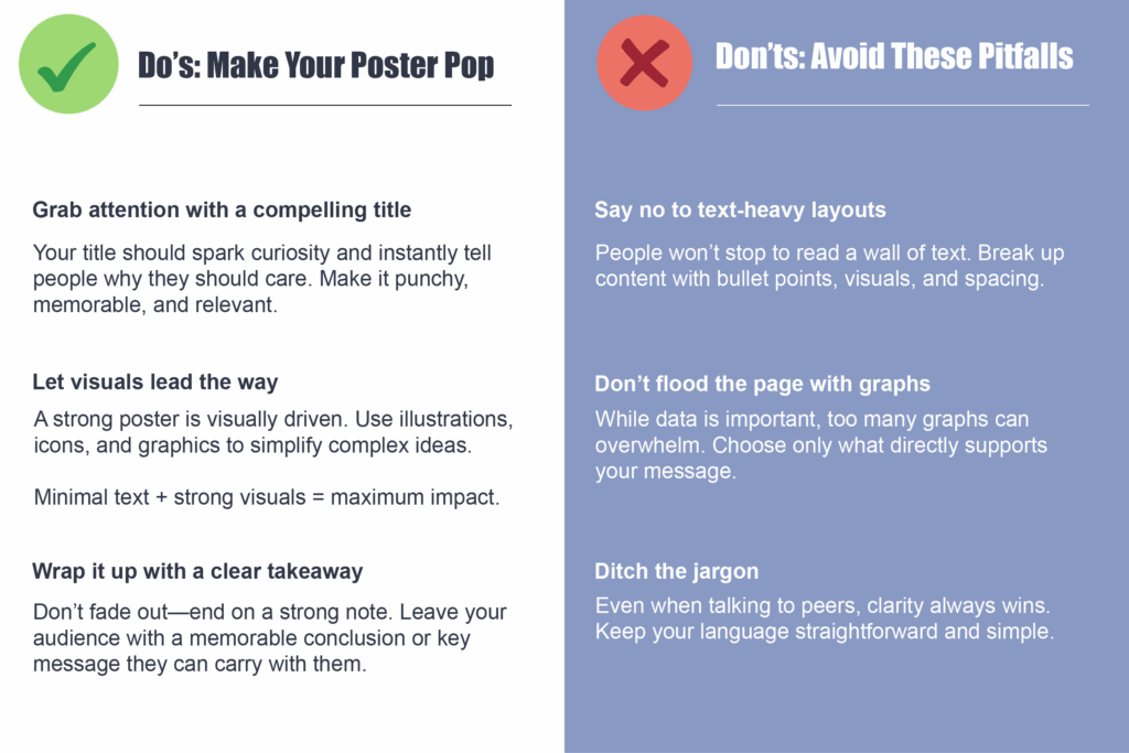
Here are some additional do’s and don’ts to keep in mind when designing your poster.
Key Takeaway
At its best, a poster is a visual handshake, inviting people to come closer and ask questions. A poster should ideally also complement your spoken presentation by highlighting the essence of your research in a way that’s visually engaging. Keep your content focused, your design intentional, and your message sharp.


